Reimagining StreamYard's Mobile Experience
My latest task has been an exciting one - completely redesigning and revamping StreamYard’s mobile experience. It kind of fell into my lap; I had some free time during my last task, and since I love stalking backlog, I found a “small” task that I knew I could do quickly. As per usual, whenever I take on tasks voluntarily because I find them cool, it ends up being a very fun ride indeed.
Mobile Header
We had realized that our mobile experience was subpar, and we needed to improve it, especially when it came to being inside the studio. For example, to return to the dashboard once in a mobile studio, you had to pray. There was no way to do it other than navigating back on Safari lol. To fix this, the task was simple - add a header bar with the StreamYard logo, same as the desktop experience. Clicking on the logo takes you back to Dashboard. A no brainer.

I think this task took me a total of 2 minutes? All I had to do was find where the Header was called, and see where we had something like !isMobile and deleted (and make sure I then added !isMobile as a condition for other components in the Header that we didn’t want on mobile, as we only needed the SY logo and broadcast title).
But then, because this was done very fast, I sort of became the designated person for mobile improvements. Muahahaha. There were quite a few other tasks for small mobile improvements (like changing the home icon to be a little house and not a camera, that was me lol, you’re welcome), but my favorite one was the juicier one - reimaging the entire experience for mobile interaction with the studio, and specifically comments.
Comments on Mobile
1. Posting Comments
Again, to post comments on mobile before, you had to gain the following knowledge by osmosis: go to the “More” menu, click on “Post a Comment”, and have a horrible bar at the bottom to post them. And onSuccess, the modals would close, so fun times! If you wanted to post several comments, good luck having the patience to reopen TWO menus each time.

The first step was to make posting comments way more intuitive. To do this, the task was simple in terms of design, but due to how StreamYard’s codebase is structured, was not immediately trivial. I had to move the CommentsInput to be called in the Comments tab, and get rid of this weird menu (small change cost me 27 file changes, ^cries in developer^).
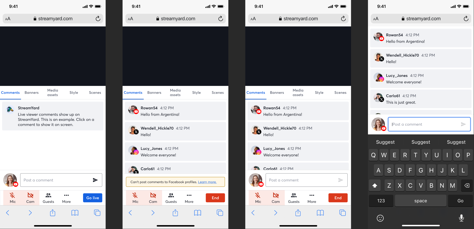
Looking much better.
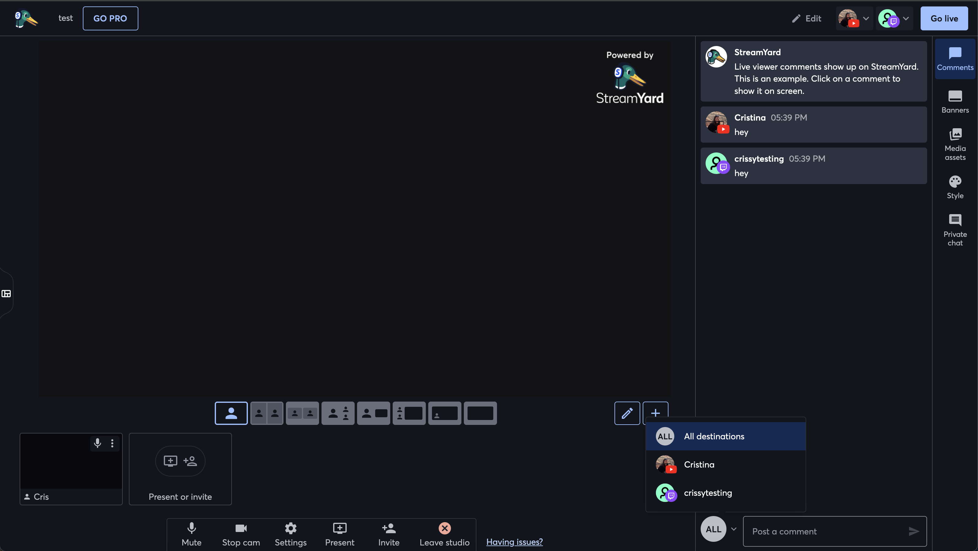
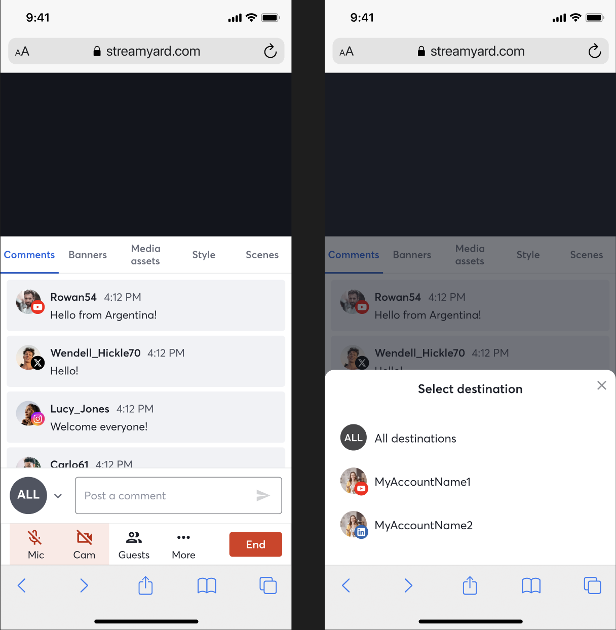
2. Select Destination
Because most of the code was initially made to be as reusable and maintanable as possibe, we had some horrible looking UIs for mobile, that probably just about work for desktop. For example, when clicking on your comments avatar when streaming to multiple destinations, you get a menu to select which destination you want to post the comment to.
Imagine having this menu pop up on mobile:
So I changed this to use a modal sheet, to look much cleaner and not have to click around like crazy to get rid of it if you clicked it by mistake:
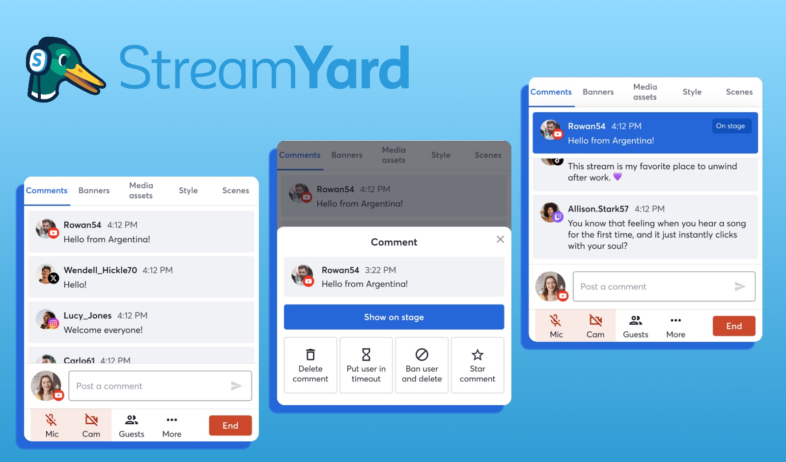
3. Interaction with Comments
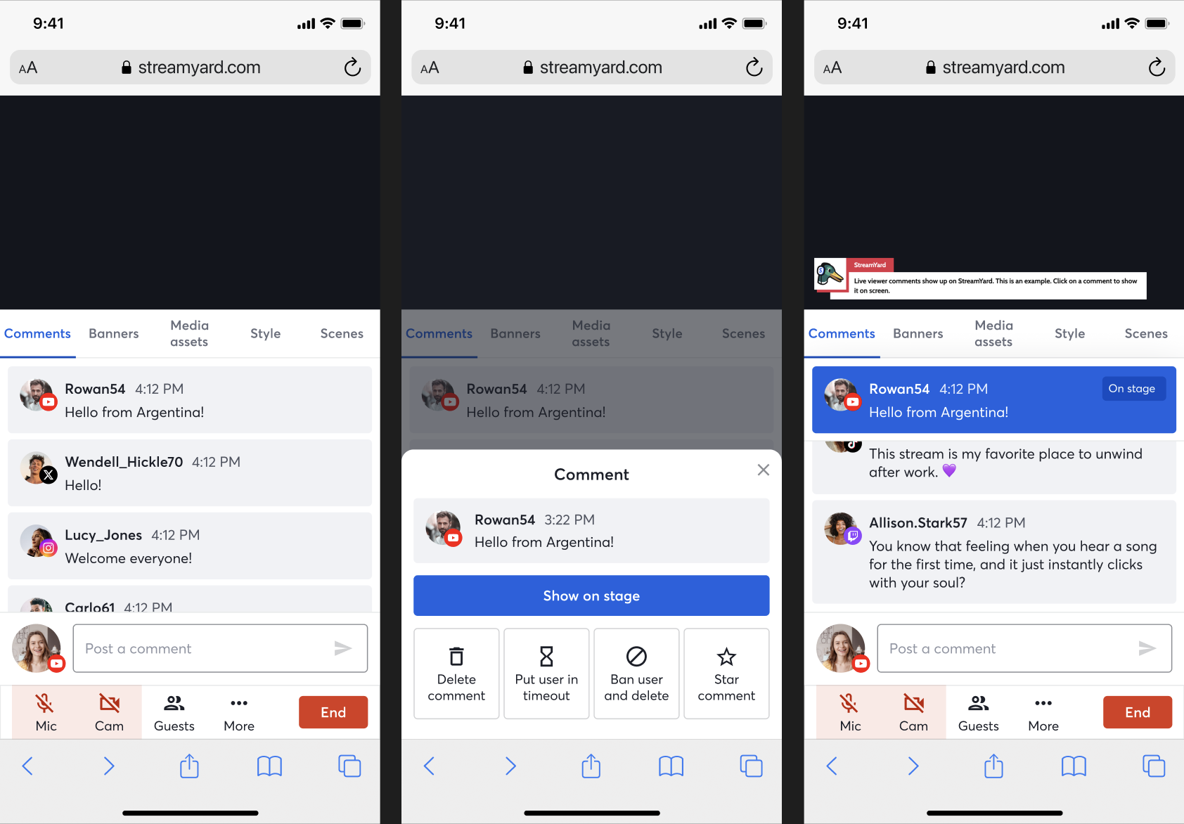
And just because StreamYard’s previous team seemed to love those horrible menus for mobile, we had another one for comment interaction:
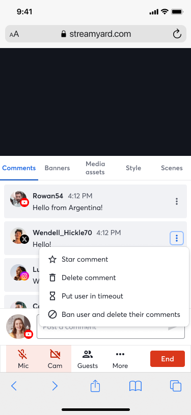
We needed a way to get rid of the awkward 3 dots menu, which by the way, on desktop appears on hover (so not a great UI for mobile). Thanks to our amazing designer, I got to implement a new flow: touch on a comment, a menu in a modal sheet appears. Easy to close, easy to interact with. If you put a comment on the stage, it should be pinned at the top of the Comments tab (I love getting to use sticky!), so it is easy to find it and just as easy to un-stage it with one click (since this is a high impact functionality - users probably want to stage and unstage comments quickly). And if you favorited a comment, you would get a pretty bubble menu (which I built to be reusable, as we did have a Tabs in-house component for the desktop UI, but no-one had ever made an equivalent for MobileTabs).

This one was a bit of a pain because there were a lot of corner cases to consider (like not showing certain menu options if a user doesn’t have permissions, making sure error tips didn’t resize components and showed properly, and different destinations allow different interactions). Really teaches one to pay attention to details.
4. The Cherry on Top
To make the most of the limited real-estate on mobile, I now had to add a way to make the menu disappear and the stage size to be reduced when the CommentsInput became focused, as this means the keyboard is showing for the user (this can’t be reproduced when testing on a computer, even if using the Chrome Simulator).
I am particularly proud of this change because it took me like an hour to figure out. 4 files changed. I love when I get tasks like this, it weirdly makes me feel like a surgeon. I have to find the necessary place in the codebase quickly, and add just a few lines for an entirely new behavior. I love my job.
I created the action in the respective ducks file and creating the reducer and selector. For those not familiar with the Redux ducks patter, this would look something like:
1
2
3
4
5
6
7
8
9
10
11
12
13
14
15
16
17
18
19
20
21
22
23
24
25
26
27
28
export const actionTypes = {
    ...
    SET_IS_COMMENTS_INPUT_FOCUSED: 'broadcast_ui/comments_input/set_focused',
    ...
}

export const initialState = {
    ...
    isCommentsInputFocused: false,
    ...
}

export const reducer = handleActions(
	{
        ...
        [actionTypes.SET_IS_COMMENTS_INPUT_FOCUSED]: (state, { payload }) => ({
			...state,
			isCommentsInputFocused: payload,
		}),
        ...
    }
);

export const selectors = {
    ...
    isCommentsInputFocused: state => state.broadcastUi.isCommentsInputFocused,
    ...
}
Then finding the component for the menu and the function that defines stage size and adding the logic to make their rendering or sizing conditional, and then passing setIsCommentsInputFocused as a prop to the CommentsInput component to trigger and propagate the state change.
Finally, adding the hooks:
1
2
3
4
5
6
7
8
9
10
11
const onInputFocus = useCallback(() => {
		if (compact) {
			setIsCommentsInputFocused(true);
		}
	}, [setIsCommentsInputFocused, compact]);

	const onInputBlur = useCallback(() => {
		if (compact) {
			setIsCommentsInputFocused(false);
		}
	}, [setIsCommentsInputFocused, compact]);
And done! Something that could have initially seemed like a complex task became an extremely fun game of catch and chase.
The result (and of course, ensuring this only changed the mobile experience):
Conclusion
I have recently taken it upon myself to try to pick tasks from backlog that I find interesting and challenging (where possible), and have been having a great time doing so. It is extremely rewarding, both in terms of how much you enjoy your job, but most importantly the wide range of skills that I have been gaining. Plus, I finished all of these tasks in just 2 weeks - loving what you do really does skyrocket your productivity. And yes, okay, it is pretty cool to say that I am the person behind the newest StreamYard mobile experience (of course, alongside many of my great colleagues).